Creators & influencers — earn 5% on every referralBecome a creator

MERCI BEAUTÉ

Maison

Brand Guidelines

How to represent MERCI BEAUTÉ with precision — logo lockups, color, typography, and the rules that keep our identity unmistakably ours.

Last updated July 7, 2026

01

Brand Identity

MERCI BEAUTÉ is a premium DIY lash extension brand owned and operated by Siam Harmony, LLC, Rancho Cucamonga, California. Our identity pairs salon-level craft with education-first luxury — every touchpoint should feel considered, never loud.

The interlocking lash mark symbolizes precision and hold — the same qualities behind our Bond + Seal system. The custom logotype is proprietary; treat it as you would any registered trademark asset.

Legal entity

Siam Harmony, LLC

Brand name

MERCI BEAUTÉ

Primary domain

mercilash.com

Tagline

Elevating everyday beauty with premium, salon-quality DIY lash extension kits.

02

Logo Variants

Five approved lockups. Download the SVG for production work; PNG is provided where raster export is needed. Each variant ships in the correct polarity for its intended background.

01

Primary Stacked Lockup

The signature lockup: lash mark above MERCI BEAUTÉ. The default brand expression for packaging, editorial, and hero placements.

Best for: Product boxes, lookbooks, press kits, and any placement where the full brand story should read at a glance.
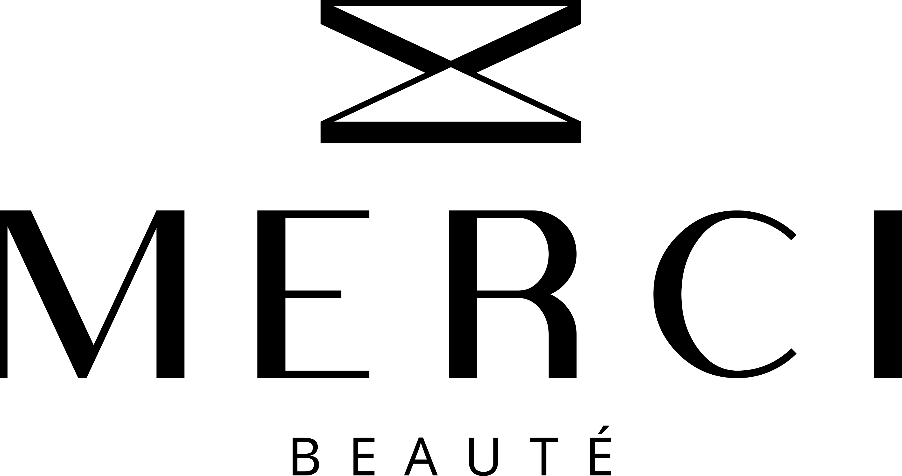
Primary Stacked Lockup — MERCI BEAUTÉ
Primary Stacked Lockup — alternate polarityAlternate color polarity

Alternate polarity for dark backgrounds

02

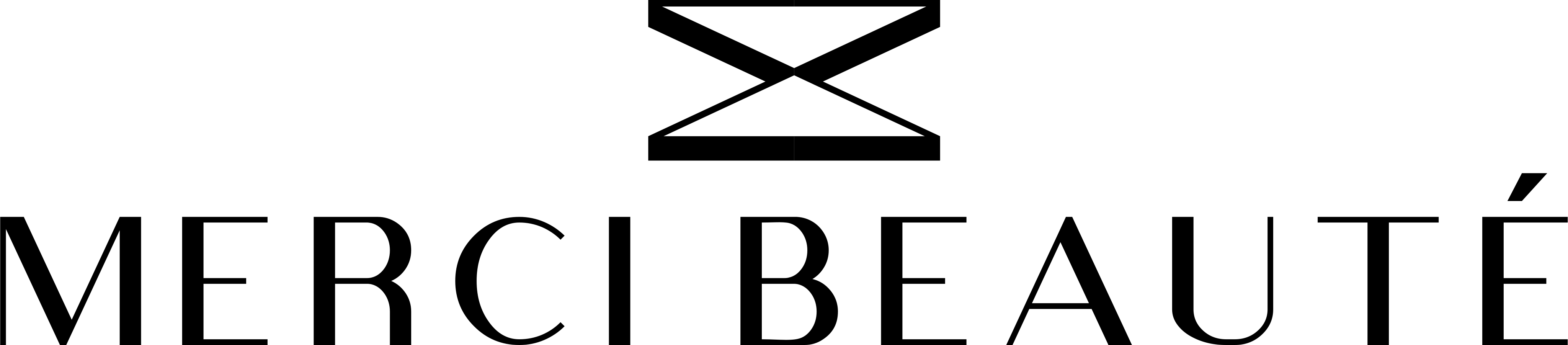
Primary Horizontal Lockup

Stacked mark and wordmark arranged in a wide horizontal format. Optimized for banners, email headers, and landscape collateral.

Best for: Website heroes, Amazon A+ modules, email mastheads, and wide-format print.

Primary Horizontal Lockup — MERCI BEAUTÉ

03

Wordmark — Compact

MERCI BEAUTÉ wordmark without the lash mark. Use only when the mark appears elsewhere in the same composition.

Best for: Secondary lockups, co-branding layouts, or when the lash mark is already present as a separate element.

Wordmark — Compact — MERCI BEAUTÉ

04

Navigation Horizontal Lockup

The lash mark beside MERCI BEAUTÉ with the signature underline. Used across the MERCI digital experience.

Best for: Website header, app navigation, social profile banners, and UI placements that need a single-line lockup.

Navigation Horizontal Lockup — MERCI BEAUTÉ
Navigation Horizontal Lockup — alternate polarityAlternate color polarity

Alternate polarity for dark backgrounds

05

Lash Mark

The interlocking lash motif — the graphic heart of the brand. Never use without approved wordmark context unless scaled as a favicon or watermark.

Best for: Watermarks, favicons, pattern fills, and brand textures where the full wordmark is redundant.

Lash Mark — MERCI BEAUTÉ

03

Clear Space & Minimum Size

Respect the breathing room around every lockup. Nothing — text, imagery, or UI chrome — may intrude into the clear zone.

Clear space diagram

Minimum clear space on all sides equals the cap height of the letter M in MERCI. Scale the zone proportionally when the logo scales.

Digital minimum

Navigation Horizontal: 120px wide

Primary Stacked: 80px wide

Print minimum

Navigation Horizontal: 1.25 in / 32mm wide

Primary Stacked: 0.75 in / 19mm wide

Contrast rule

Logo must meet WCAG AA contrast against its background. When in doubt, place the logo on a solid cream, white, or black field.

04

Color Palette

Ink

#0A0A0A

Primary text, dark backgrounds, luxury contrast

Black

#000000

Logo on light surfaces, UI chrome

Cream

#FAF9F6

Primary site background, editorial warmth

Stone

#E8E2D6

Secondary panels, soft section breaks

Gold

#C9A962

Accent foil, premium highlights, packaging trim

Gold Light

#E8D5A3

Subtle metallic wash, hover states

Gold Dark

#8B7340

Deep accent, embossing, secondary foil

White

#FFFFFF

Logo on dark surfaces, product photography

05

Typography

Display / Headlines

Viola, serif

Used for hero headlines, editorial titles, and luxury moments across mercilash.com.

Body / UI

Inter, system-ui, sans-serif

Navigation, product copy, forms, and interface text. Light weight for body; medium for labels.

Label / Eyebrow

Inter, uppercase

10–11px, tracking 0.2–0.3em, uppercase. Used for section eyebrows and CTAs.

06

Do & Don't

Do

  • Always write the brand name as MERCI BEAUTÉ — all caps, with the acute accent on the final É.
  • Use approved SVG files from this page. SVG preserves crisp edges at every scale.
  • Match logo color to background contrast: dark logo on light surfaces, light logo on dark surfaces.
  • Maintain clear space equal to the height of the letter M in MERCI on all sides of any lockup.
  • Keep the lash mark and wordmark proportions intact — never stretch, skew, or rotate.
  • Use Navigation Horizontal for digital UI; Primary Stacked for packaging and editorial.

Don't

  • Do not separate the lash mark from the wordmark unless using the approved Wordmark — Compact variant with mark elsewhere.
  • Do not change logo colors, add gradients, drop shadows, outlines, or glow effects.
  • Do not place the logo on busy photography without a solid or blurred backing field.
  • Do not use "Merci Beaute", "Merci Beauté", or "MERCI BEAUTE" — the accent and capitalization are non-negotiable.
  • Do not recreate, trace, or substitute typefaces for the custom logotype.
  • Do not imply partnership, endorsement, or co-branding without written approval from Siam Harmony, LLC.

07

Usage & Licensing

MERCI BEAUTÉ logos and brand assets are the property of Siam Harmony, LLC. Press, retail partners, creators, and agencies may use these assets only for approved MERCI BEAUTÉ representation. Unauthorized modification or third-party co-branding requires written permission.

For press kits, wholesale co-branding, or asset requests beyond this page, contact our team.

Contact Brand Team